A small committee of volunteers organises the Kirkstall Art Trail, and we are fortunate that amongst our number is a talented graphic designer. This last year, we have discussed refreshing the logo, and we can now reveal it to you.
Our logo is not only used for the website but also for our posters, newsletters, social media, and promotional banners. We may even use it on T-shirts, pin badges, mugs, tote bags, and anything else that we can think of!
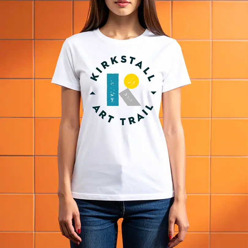
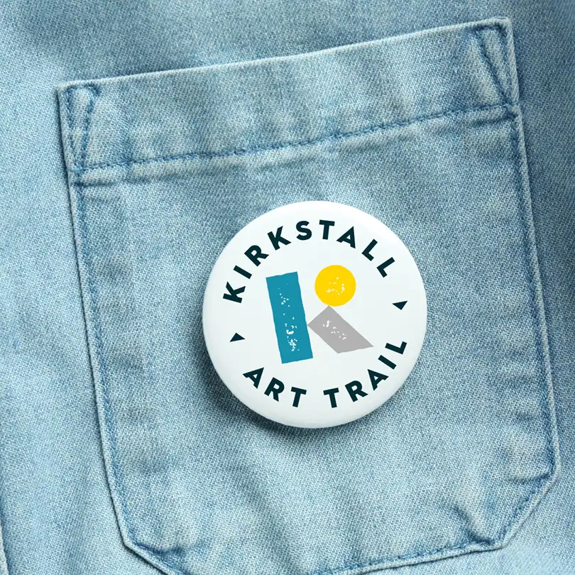
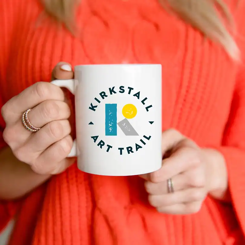
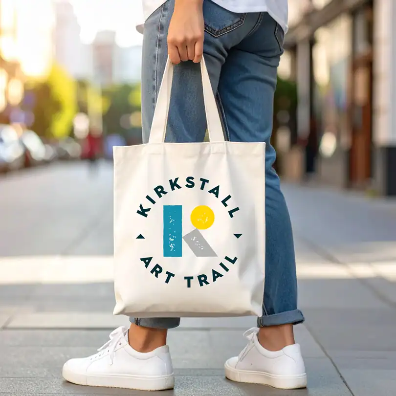
About the logo
Graphic designer Jon Simmons tells us a little about the ideas behind the new design.
“This year we’ve decided to refresh our visual identity. I’ve given the logo a more contemporary, tactile look and feel to reflect the diverse range of participants and visitors to the event whilst retaining its approachable look and feel.”
Website refresh
Over the last few months, our website admin, Mindy Goose, has also been tweaking the layout and look of the website.
“I have reviewed our website accessibility and made some positive changes. Whilst making those changes, I have redesigned the layout, making it easier to navigate the website. I have kept the design consistent across the site and adhered closely to the Web Content Accessibility Guidelines (WCAG).”
Mindy is an accessibility advocate, so it was important to her to get this right, not only what you see and read on the screen, but also within the building blocks that make up a website. In addition, we are also ensuring that we stick as close to our commitment to having an environmentally sustainable website as possible.
Your thoughts
We hope that you like our new look and we’d love to know what you think about the new logo! Also, let us know, if we made it would you buy our merchandise? You can comment below:
